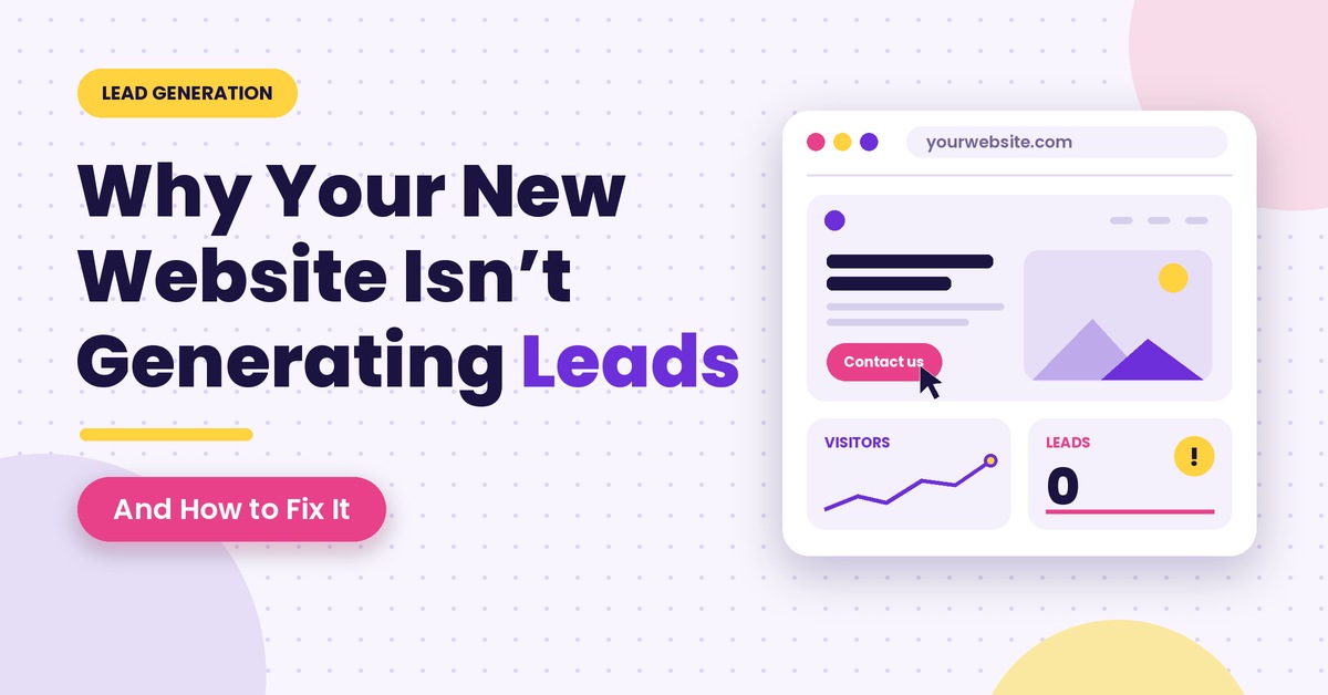
You spent months on the project. Went through loads of presentations, argued about brand colours, selected the photos (all high res), paid the big invoice to get it to the point of launch. Launch day came and the new site went live and the link was shared out across the team on LinkedIn.
Then came the silence.
Days become weeks. The traffic counter is showing people are coming in but your inbox is still completely empty. The contact form is collecting dust. The phone doesn’t ring very often. For any business owner or marketing exec this is one of the most frustrating situations in business. You’ve done everything “right” and your brand new digital asset is just sitting there like a billboard in the middle of a desert.
When companies hit this wall, they tend to go to a professional web development agency in Mumbai to work out what the problem is. The reality is that a website which looks absolutely fantastic on screen is not necessarily a website that will generate business. There’s a huge gap between a pretty digital brochure and a website that actually functions as a sales machine.
The Core Trap: Designing for the Boardroom Instead of the Buyer
The vast majority of websites don’t fail because of bad coding or bad design. They fail because the design process didn’t focus on the right audience.
During a normal redesign the people who are signing off on the pages are internal execs, brand managers and the various department heads. It’s perfectly normal to want a website that is contemporary, impressive and of a high standard. You want something that looks absolutely stunning and makes the competition look rather dull. You want it to be the sort of site that would look fantastic in your annual shareholder presentation.
The problem is your customers don’t give a damn about your design awards or your internal company accolades.
When a potential client comes to your website they’re not there to look at the website. They have a problem, they have a budget and they have a business issue. They’re asking themselves three very simple questions:
- What do you actually do?
- Can you solve my specific problem?
- What do I need to do next to get started?
If your site takes more than five seconds to answer those questions, visitors leave and click on your competitor’s link. High-performing websites do not try to entertain visitors; they guide them effortlessly toward a solution.
The 7 Silent Leaks Killing Your Website Conversions
Let us examine the exact reasons why a visually attractive website fails to produce business inquiries, along with the straightforward fixes you can implement right away.
1. Your Value Proposition Fails the “5-Second Test”
A prospect coming to your homepage will see at the top a full width background video of city lights and a big heading:
‘Empowering Synergistic Innovation for Next Generation Paradigms’
It’s not clear what they actually do. Are they in the cloud computing business? Do they provide corporate training? Are they into office furniture?
The answer isn’t obvious.
Vague corporate speak is a huge contributor to poor conversion rates on business websites. Your attempt to sound clever invariably results in a message that is utterly incomprehensible.
The brain takes 3-5 seconds to work out whether a site is relevant. If your visitor has to read three paragraphs to work out what service you’re actually providing then they’re just going to hit the back button.
The Fix:
Rewrite your main headline using simple, direct language. Use this formula:
[Who you help] + [The problem you solve] + [The tangible outcome you deliver]
Rather than: ‘Revolutionising the future of commercial workplace operations’.
Say “We help manufacturing plants reduce their facility maintenance costs by 25% with zero operational downtime”.
2. Weak, Buried, or Competing Calls-to-Action (CTAs)
A site with no clear obvious directions is like a department store with no signs, no staff and no cash registers. Many business sites suffer from two extreme CTA mistakes.
- The Timid Approach: The only way to contact the company is a tiny link tucked away in the header navigation that says “Contact Us,” or a gray “Submit” button at the very bottom of a 3,000-word page.
- The Cluttered Approach: A single page presents five different options simultaneously: “Sign up for our newsletter,” “Download this PDF,” “Watch this product tour,” “Follow us on Instagram,” and “Schedule a call.”
When you’ve got too many options in front of a visitor, psychological friction kicks in and they end up doing nothing at all.
The Fix:
Pick one primary action for every page.If the objective of your service page is to get a discovery call booked then ‘Book a Discovery Call’ is your primary action. It should be a button of a contrasting colour to the rest of the palette. It should be above the fold (so it’s visible without having to scroll), repeated as the user scrolls down the page and all other options should be kept in the background.
3. Lead Capture Friction (Asking for Too Much, Too Soon)
Imagine walking into a shop to ask the price of a jacket and the salesperson insisting you hand over your phone number, your address, your company name, your annual income and your job title before they will tell you the price. You’d walk out of that shop straight away.
Yet hundreds of B2B and service websites do exactly that on their enquiry forms.
Every additional field you put in a contact form will reduce your conversion rate. Your sales team will no doubt be delighted at the prospect of getting such rich profile data straight away, but your prospects will see the long form as an unwarranted intrusion into their privacy and as a chore.
The fix
It is to strip the form down to the absolute essentials required to kick off a conversation: Name, Email/Phone and a short message box. You can then take the opportunity during the initial phone call or via an automated email follow-up to get the more detailed information such as budget and company size. The aim is to make it as easy as possible to start the conversation.
4. The Trust Deficit: Expecting Faith Without Evidence
Online buyers are going to be sceptical. They don’t know who you are. They’ve been had by bad vendors in the past and they know it’s easy for anyone to put together a very attractive website in a weekend. If your site is making some pretty bold claims such as “We are the leading digital consultancy” or “Trusted by hundreds of happy clients” and you don’t have the actual proof on that very page then you’re going to lose people.
Trust is built through concrete, external validation:
- Client Logos: Well known brands or industry peers that you’ve worked with.
- Real testimonials: testimonials that contain the person’s full name, their actual photograph, their company title and the specific result they achieved. Vague quotes signed simply “John D.” have no credibility whatsoever.
- Case studies with hard numbers: rather than just describing what you did, focus on what you achieved. “How we helped Brand X reduce their customer response time by 40%.”
Accreditations and Security Badges: Industry partnerships, ISO badges, or verified review platform widgets.
The Fix
Place social proof right next to your decision points. Put a short, punchy client quote directly below your contact form or beside your booking calendar. It provides immediate reassurance right when a buyer is about to submit their private information.
5. The Mobile Experience is Clunky or Frustrating
Over 60% of all internet browsing is on handheld devices. In many B2B sectors the people making the decisions will be reading an article or looking at a vendor proposal on their phone between meetings or on their way home in the evening. A site can be technically responsive (i.e. it will shrink to fit the screen) and yet still be completely unusable in practice.
Common mobile usability issues include:
- Tiny buttons which are a pain to tap with a thumb without inadvertently tapping the adjacent links.
- Full screen popups which can’t be closed as the ‘x’ is outside the mobile viewport.
- Huge blocks of unbroken text which look like a wall on a 6″ screen.
- Phone numbers which you can’t tap to dial.
The Fix
Test your website on actual phones, not just in a desktop browser’s resize tool. Ensure buttons are at least 48 pixels tall, use sticky bottom bars for key actions (like “Book a Call” or “WhatsApp Us”), keep paragraphs under three lines, and confirm form fields zoom smoothly without distorting the layout.
6. The 3-Second Speed Threshold
Site speed isn’t just some obscure engineering issue. It’s a financial metric.
When someone clicks your link (particularly if it’s from a paid ad or a social post) they expect instant gratification. There’s a body of research which shows that as your page load time goes from one second to three seconds, the chance of the visitor leaving increases by over 30%. By five seconds it’s over 50% of your traffic that’s gone before your logo has even loaded.
High resolution stock photography, uncompressed video and dozens of unmanaged marketing tracking scripts will all have a bearing on your site speed. If you’re spending marketing dollars to drive traffic to a page that takes four seconds to load you’re effectively wasting your budget.
The Fix
Run your key pages through free tools like Google PageSpeed Insights. Compress all images using modern formats like WebP or AVIF. Remove outdated tracking pixels you no longer look at, and work with your dev team to clean up code that blocks the browser from displaying the main content quickly.
7. The “Homepage Trap” in Paid Campaigns
If you run Google Search ads, Meta campaigns, or LinkedIn sponsored posts, where do you send that paid traffic?
A massive percentage of businesses send paid visitors straight to their homepage.
Homepages are designed to be general airport terminals. They introduce the broad company history, link out to company news, show job openings, feature blogs, and list every product you offer. When someone clicks an ad searching specifically for “Commercial HVAC Repair in Bandra,” landing on a homepage that discusses “Complete Engineering Facilities Since 1998” confuses them. They do not want to hunt through a menu to find the repair page—so they leave.
The Fix
To create dedicated, focused landing pages for each campaign. A campaign landing page would have the main header menu stripped away and would be 100% focused on the one service you’re promoting in the ad, with a dedicated enquiry form.
Aligning Traffic with True Buyer Intent
Occasionally a website’s conversion issue is actually nothing to do with the design at all and everything to do with the type of person who is landing on it.
If your marketing is bringing 50k visitors who are looking for free guides, free DIY templates or free college research papers then none of them are ever going to fill out a commercial contact form. They’ve got what they came for, they’re happy, they’ve done their job and they’re gone. Your business sees zero revenue.
This is where a smart commercial search strategy makes all the difference. To drive high value inquiries you need your content and site structure to mirror exactly what the ready to buy decision maker is actually going to type into a search engine. By integrating comprehensive SEO services into your ongoing growth plan, you ensure your site attracts high-intent prospects searching for specific solutions, rather than casual browsers seeking free definitions. When high-intent visitors meet a frictionless landing page, conversion rates naturally rise.
The Post-Conversion Black Hole: What Happens After the Click?
Here’s a fairly common scenario that gets missed by pretty much every website audit: the website has actually generated the lead, the company’s internal process has simply killed it.
Ask yourself these practical questions:
- When someone fills in your contact form where does that notification go? Does it go to some general info@company.com address which someone then checks once every two days?
- Does the sender get an instant, personalised confirmation email which sets out the timescales for when they’ll get a reply?
- Does your sales team call back in 15 minutes or does it take 48 hours?
Research into sales enablement shows that organisations who make contact with inbound leads within 5 minutes are up to 21 times more likely to qualify that lead than those who wait even 30 minutes.
If they complete your form during the course of their working day then they’re in the market right now. If it’s two days before you get back to them they’ve already spoken to your competitor, got a quote and booked a meeting.
Your conversion system doesn’t end when the visitor clicks “Submit”. It only ends when that lead is in your CRM and being met by a real person.
The Website Lead Generation Audit
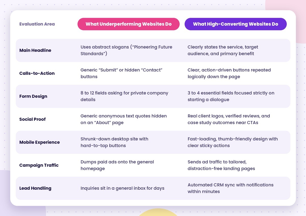
Use this side-by-side comparison to evaluate your current website. It outlines the clear differences between a typical, underperforming site and a conversion-focused platform:
Partner with Social Pill for Measurable Digital Growth
Building a website that generates a steady stream of high quality business enquiries requires a balance of good design, good engineering, good search visibility and a good conversion strategy. That’s precisely the mindset that underpins Social Pill.
Social Pill is a full service digital marketing agency in Mumbai that works with a range of brands from the growing to the enterprise to close the gap between creative design and real business revenue. We provide full suite of services including modern website development, performance marketing, conversion rate optimisation (CRO) and sophisticated organic search. We don’t just build websites, we build complete digital customer acquisition systems that are designed to grab the attention of the buyer, generate the right kind of leads and deliver on your ROI.